
Just because I have a new “one in, one out except for necessities rule doesn’t mean that I’m not still window shopping and paying attention to new stuff. I like pretty things. Sue me.
I found a UK company, Ponyo Horsewear, that makes BADASS blankets that I definitely must get for Presto for next season (since, as expected, the hand-me-down’s he’s worn this year will not live to see another winter). They have two prints in particular that are perfect for him:

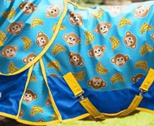


I couldn’t decide which one to get so I’m thinking he’ll get a light sheet in the monkeys and a midweight in the unicorns. They won’t be available in his size until next month so they’ll definitely be for next winter, but they’re just too perfect. Shipping from the UK is expensive, but if anyone local to me is interested in buying some too, let me know and maybe we can do one order and split shipping.
Otherwise, the SS20 collections are starting to roll out. Equestrian Stockholm already rolled out a nice dark green color that captured me probably more than any other matchy set ever has. It’s pretty.

I think the matchy sets still just aren’t really my thing though. Not like that anyway. Maybe if the pad had navy trim I’d be in, the beige just kind of kills it for me. Or if I liked the shape of the jump pad. Or if the boots weren’t shiny. I seem like like very matte suede and very sparkly glitter, but not really anything in between and def not patent. Maybe when they go on sale I’ll like them more. It’s a lot of money to spend on mass quantities of exactly perfect color coordination for someone who literally spent all of Sunday wearing her $29 riding tights backwards and not realizing it until she took them off in the evening (that happened. I did that.). The green is really pretty though.
Speaking of green, the SS20 collection I was most looking forward to was Premier Equine’s. I’m low key obsessed with the merino wool pads, and my only complaint is that most of their color combinations are ugly AF. Like, no, I do I not want lime green and turquoise, or hot pink and dark green, or orange and teal. I have the plain navy ones and the plain white ones, because those are the ones my eyeballs can handle, but I was totally down for adding another pad to the collection if they did some new color combinations. I was all up in their instagram suggesting new dark green merino pads like a crazy person. Like dark green with navy or dark green with natural, or even dark green with gray. I’d buy that.

But they rolled the collection out without adding any new color combos to the merino wool collection at all. It’s confusing, because you know what people will buy 9000 of, if you just keep making them in new seasonal colors? Good saddle pads. Equestrian Stockholm and PS of Sweden have made entire businesses based on that premise. PE did add other new saddle pad styles and shapes, but largely in basic colors. And I don’t want new pad styles, I want the trusty merino wool ones that are A++. So, sadly, another year goes by at PE with the same bad color combos and no new ones. Womp womp.

Luckily I had already pre-given up on PE and ordered a Presto-color-palate pad from Hufglocken last month, because coupon. Navy with dark green and gray piping. It will probably be months before it gets here but that’s fine because I didn’t actually need it yet anyway, it just drove me damn bonkers to look at his green bridle/green breastplate/navy pad that just did not coordinate at all. The pad needed some green to make it cohesive (but not too much green to make it matchy matchy), okay?

I am still holding out a thin glimmer of hope that Punk Ponies will someday roll out a version of their glitter boots in a nice super dark green. Those would be mine in .2 seconds if they did, I don’t even care what I’d have to get rid of to satisfy the “one in, one out” rule.

I’ve also, as always, been keeping my eye on Riding Warehouse’s “new” section. They’ve added some good stuff lately, like Ego7 boots (they even have brown!), the Champion MIPS helmets, fancy new girths, clothes in new SS20 colors (Kastel, we have to talk. Are you ok?), and lots of new saddle pads and colors. Again, a slightly disappointing lack of dark green all around, but there’s some burgundy, which I’m also kinda into. Ya know… if it can’t be navy or green.
What new stuff has caught your eye? Any SS20 collections that are really blowing you away?

So disappointing there isn’t more dk green! I agree with you on the beige trim on the ES stuff – yucky. But, those metallic green boots are kinda cool looking…
LikeLike
I have been watching those ponyo blankets too, just waiting till they release more sizes! I don’t understand the PE colours either…
LikeLike
Oh, yeah the PE saddle pad combos…. Those combos are just BAD. I wanted to try one, but couldn’t justify another navy or white pad so that was out for me. I agree they need more colors. Or just…can we pick and choose? lol Still love that green bridle on Presto! And staying away from all things new so I’m not even tempted lol
LikeLike
Yeah, wtf Kastel? And I don’t understand who designs the color combos for PE. So. Many. Questions. Why.
LikeLike
Stacie and I have spent a lot of time wondering who’s responsible for those too. They’re missing a real opportunity there, the pads are so nice for the price.
LikeLike
I tried on a pair of blue-grey snakeskin Goode Rider tights for laughs and was blown away by the price tag. And also how poorly they fit me at that price point. And also the blue-grey snakeskin. But it was good for a laugh.
LikeLike
Snakeskin…. why… who…
LikeLike
I got a forest green equestrian Stockholm pad on a boxing day sale. It’s a pretty color, but even on clearance I feel like I paid too much for construction wise what seems like a pretty average saddle pad. Those merino PE ones are nicer 🙂
LikeLike
What is “SS2020”? Lol. But seriously.
LikeLike
Spring/Summer 2020, like the new collections
LikeLike
I had the same thought about the kastel colors! 😂
LikeLike
The blankets featured here made me smile. I had not seen them before. Nice to see designers put a sense of humor into their creations! My own favorite is red, especially if I am riding a bay horse. I saw Kerrits had a few new items offered in red for this Spring, including a rain coat that caught my eye.
LikeLike
Still waiting for someone to release a poop emoji blanket…
LikeLike
I think I’d need a full wardrobe for all of my horses if they made that…
LikeLike
I too was watching RW for Kastel’s new colors…womp, womp. 😦
LikeLike
It’s… really not good…
LikeLike
Hunter green is usually more of a fall color… so I’m holding out hope that mid summer we’ll see LOTS of it! Which I’m probably just getting my hopes up. But that’s a long way off, and maybe we can all just keep poking the bears till they break and make EVERYTHING GREEN.
LikeLike
I saw the ES Amazonite as well and thought *amazing* until I realised how manky the beige binding is likely to get.
If you love it, the ES Emerald is pretty much the same base colour and it does have navy binding. They’re a bit hard to find though. It took me ages to get my hands on one, but obviously I am wildly pro matchy so it was a commitment I was willing to make.
LikeLike
So I have both colors in the boots, and the emerald is a much more yellow green. The amazonite has more of a blue undertone. So they’re pretty different. But both pretty!
(And yes. I know. I have a problem.)
LikeLiked by 1 person
I find this surprising, I could swear my emerald has a more blue base to the colour, but definitely not as blue as amazonite.
At the very least it solves the beige binding dilemma
LikeLike