Sorry I’m a little late with this! There were so many good logos submitted that it took a little longer to get everything sorted and ready to roll. Many thanks to all of you who sent logos to Michelle… the entries were a little slow to start but by the end she had over SIXTY to choose from! Picking a winner was no easy task, I’m sure. So, without further ado, the winning logo is:

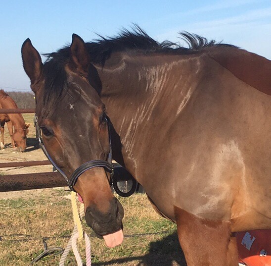
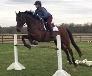
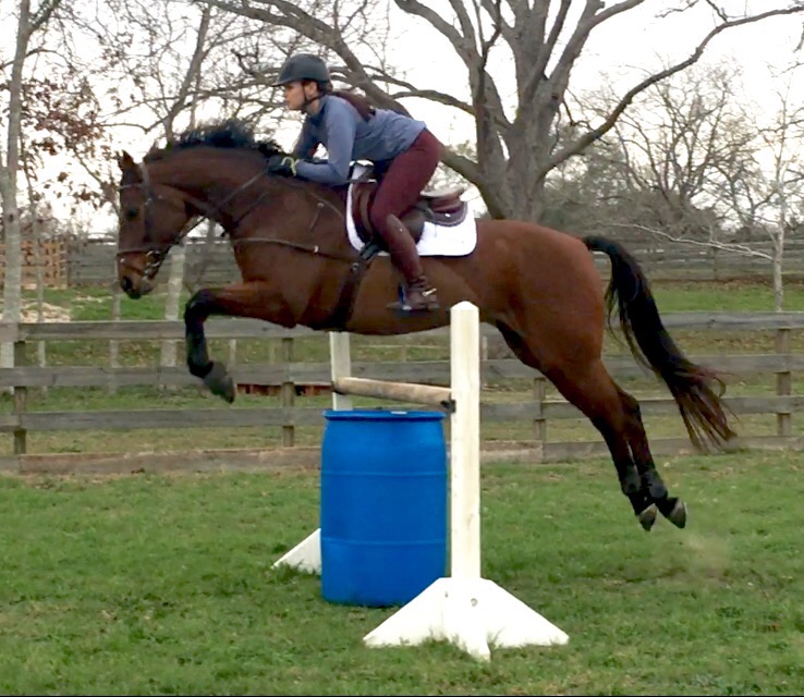
There were several top contenders, but in the end it came down to a matter of branding. What was the most versatile logo that went best with the vision of Willow Tree Warmbloods as a business? What would embroider well on a hat or jacket, translate well to a computer screen, and look right at home on the saddle pad of a Grand Prix horse? In the end, this logo (which is Lissa jumping over a willow branch, with a round shape that hints at something global or international) gave WTW a logo that serves as easily recognizable branding for the business. And if you’re into the symbolism side of things, willow trees are known for being able to take root and grow in pretty much any environment just from planting a single branch, so the “hidden meaning” here is super cool – like each WTW horse is it’s own branch, ready to take root and grow into something marvelous. It’s simple but poignant, and truly representative of the WTW vision.
We also picked two runners-up to receive gift cards from Riding Warehouse! Congrats to the creators of these two logo concepts:


Just to give you an idea of exactly how hard this decision was, here’s just a tiny sampling of the entries submitted:

Britt, Leslie, and Carrie, you should all have received emails this morning about your prizes. Many thanks again to everyone for your time and effort and participation!
And of course, extra special thanks to all of the companies that pitched in and made it possible for us to offer such an awesome prize pack: Lund Saddlery, Teddy’s Tack Trunk, Hamer & Clay, and All Ears Selfie app!