
It turns out that me tossing in that little stadium statistic in my Corona recap a couple weeks ago (only 15% clear rounds in our division) was just the beginning of something bigger. My barnmates and I got to talking over the weekend about which venues seem to produce more rails in stadium, which ones tend to have “easier” XC, etc etc. Then I starting thinking – surely I can come up with some numbers to substantiate our hypotheses. Lord help us all when I start trying to math.

It took me a really really ridiculously long time but come to find out I CAN actually count, and luckily the internet has a percentage calculator so I didn’t really have to do much of anything except plug numbers in. Praise Google.
So here’s what I did: first I had to figure out what numbers we actually wanted. I decided to only do venues in Area 5, and only calculate statistics for Novice and Training level – the ones I care about. I decided to look at the percentage of clear rounds (jump penalties only – I threw out time penalties for this) for both stadium and XC at N and T at every venue in Area 5. For XC, jump penalites consisted of refusals, retirement, or elimination. I threw out every TE because those are more rider error and therefore not really valid for what I was after, and also threw out W’s because there’s just no telling why people withdrew. For stadium if there was one or more rails, it wasn’t a clear, obviously, but I didn’t factor in time faults for that either.
Then I started adding them up and calculating percentages for each show at each venue over the past two years. I could have kept going back a couple more years for more data, but a) my eyes were already starting to cross with just two years worth of data b) I noticed that the numbers at each particular venue tended to be about the same at every event c) since each venue has at least 2 shows a year I already had a minimum of 4 data sets per venue. Of course, that data can have a lot of factors behind it. Bad weather could lead to a high percentage of problems, or something else weird going on could skew things. For the most part though the numbers were consistent across the board. When I had a percentage for every show at every venue I then went venue by venue and averaged out the percentages to come to one final number. Here’s what they look like
Novice:

There was nothing too surprising to me here. I figured Corona and Greenwood would have the toughest stadium and they did. Good to know Holly Hill is right in there too. Does Feather Creek super glue their rails to the cups?
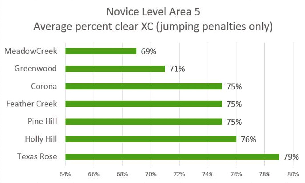
On the XC side of things nothing was particularly surprising either except that Texas Rose had a much higher “Clear Rate” than I expected. But having ridden around it, I can understand why. It’s not small and has some technical questions, but it’s pretty open and gallopy and inviting. It’s also worth noting that there’s only a 10% spread between the highest and lowest percentage of clears – not a very big margin.
Training:

Training was interesting to see too, just because I’ve never really paid much attention to the Training level courses at most of these venues and obviously I haven’t ridden any of them (except MeadowCreek a million years ago). If you throw out the top and bottom numbers in stadium they’re all pretty darn close. Also no surprise that the general Clear Rates for Training stadium are less than Novice. 
The XC I thought was interesting. Holly Hill was far and away the “winner” there, I’m guessing because it’s another open, gallopy course similar to Texas Rose’s Novice. Mental note to also walk the Training course when we’re at Holly Hill for Novice Championships next month… I want to see for myself!
In general these numbers really aren’t that scientific and probably don’t mean a whole lot in the grand scheme of things. But it was interesting to put together, if nothing else, and will certainly make me pay a little bit more attention going forward.
And with that, I have far exceeded my quota of math for the year.


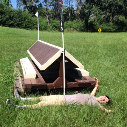


 Photo Credit to Terri Hatcher for most of these!


